
Lessons from the inflation battle of the early 1980s.
When the markets are in a bear phase, “expert” predictions about the ultimate low start flying fast and furious. Every market analyst wants to be seen as the “genius” who figured it out so they can crow about it for the next decade—no matter how many other calls they might miss. During protracted market selloffs, a chorus of analysts typically estimate ever more extreme lows. Right now, many among this current group of bears are predicting a low price-to-earnings multiple of about 14x earnings on the S&P 500, while the more extreme of the bearish group are calling for a low of about 12x earnings. If we generously assume earnings of $220/share for the S&P 500 in 2023 (they could, of course, be lower), a 14x multiple imputes a target of ~3,080, while a multiple of 12x assumes a target of ~2,640. Those targets imply an additional drop in the index of approximately -23% and -34%, respectively, from the recent level of ~4,000. This decline would be in addition to the amount the S&P 500 is already down from the high that was set at the beginning of 2022, which is currently about -17% on a price basis (closing prices, excluding dividends from 1/3/2022 @ 4,796.56 to 4,000). Additional losses of the magnitude suggested above would put us close to the range of the damage suffered during the Global Financial Crisis, when the S&P 500 experienced a decline of over -50% on a price basis.
The markets are currently navigating the Federal Reserve’s fight to bring inflation down, and we have seen a fight like this before in the early 1980s. Looking carefully at what happened during that period might prove helpful in finding some hints about how valuations may evolve in the present struggle.
Inflation and the Markets in the Early 1980s
Overall, stock market conditions in 1980 were historically difficult. Interest rates and inflation had skyrocketed, and the public was focused on concepts like the misery index, reflecting the general malaise at the time. Paul Volcker, chairman of the Federal Reserve, was undertaking historic, rapid increases in the Fed funds rate to staunch the threat of high inflation. History shows that his interventions worked, but there was a price to pay in the real economy and the stock market, which now faced radically hawkish Fed policy as a major headwind. The markets had not made much headway over the prior decade, and conditions were volatile, to say the least.
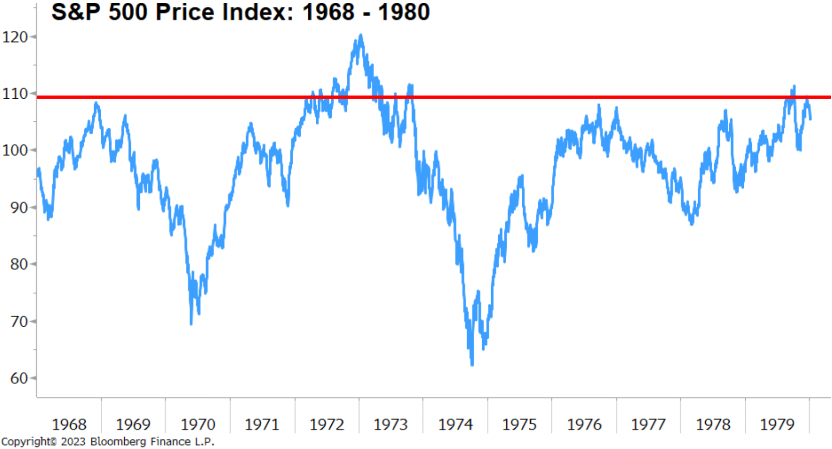 Figure 1 – S&P 500 Price Index: 1968-1980
Source: Bloomberg Finance L.P. (03/27/2023)
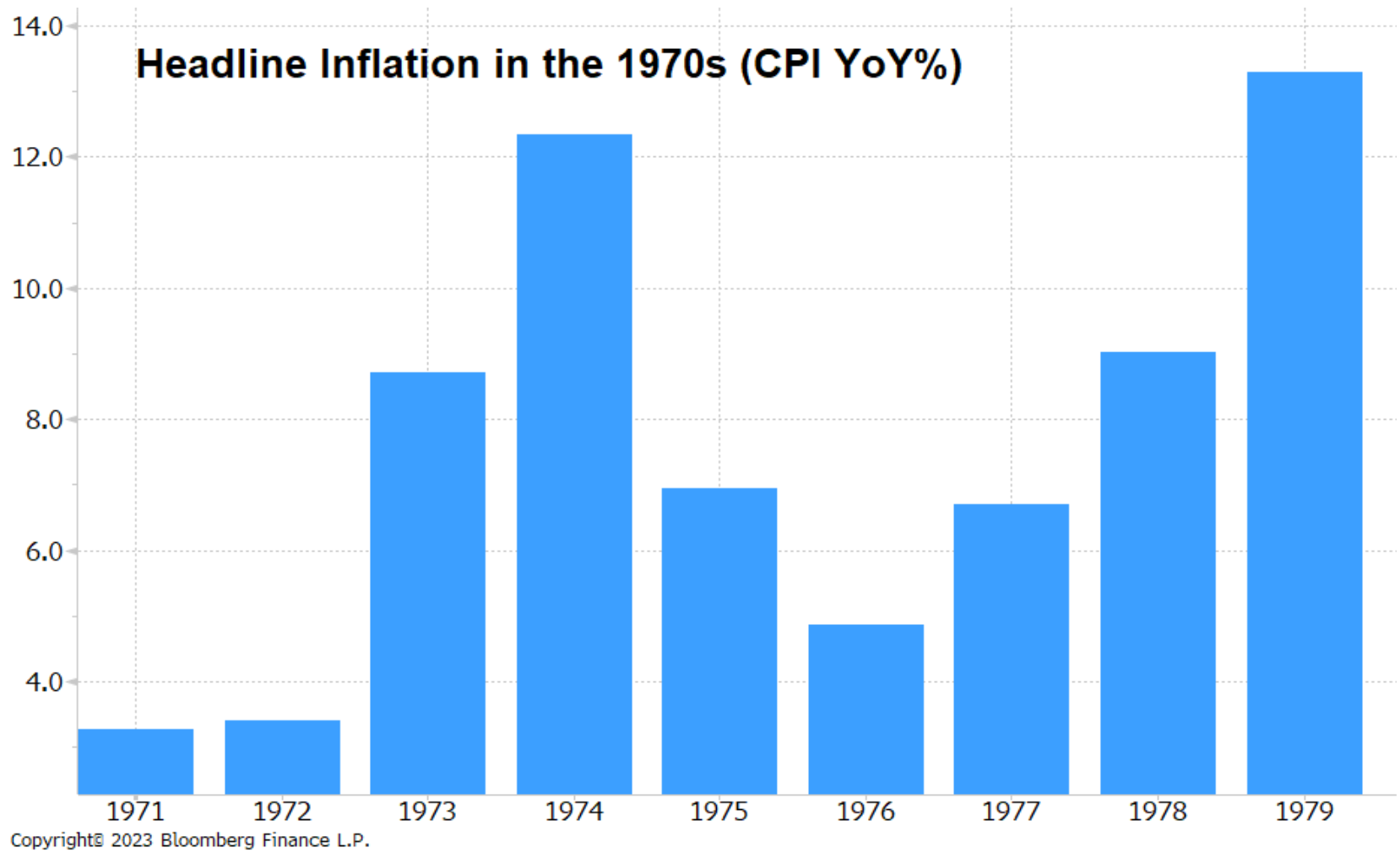 Figure 2 – Headline Inflation in the 1970s (CPI YoY%)
Source: Bloomberg Finance L.P. (03/27/2023)
Paul Volcker took over as chairman of the Federal Reserve in August 1979, and there were two recessions within the first three years of his tenure. To combat the runaway inflation, Volcker led the Federal Reserve to raise the Federal funds rate from about 11.20% in 1979 to a peak of 20% in June 1981. As a result, there was a six-month recession in 1980, followed by another recession in 1981 that lasted 16 months. From the beginning of 1980 through the end of 1982, the United States was in a recession for 22 out of 36 months, or more than 60% of the time.[1] Between December 1980 and August 1982, the overall stock market, as measured by the S&P 500, dropped almost -30%. There are many parallels between the inflation fight of the early 1980s and today, so let’s look under the hood and compare price movement, earnings, inflation, and valuations.
The chart below compares inflation (CPI YoY%, red bars), S&P 500 earnings growth (YoY%, blue bars), and the S&P 500 price index (solid black line) with periods of economic recession highlighted in light-red rectangles. The S&P 500 dropped approximately -30% (red circle), while inflation stayed stubbornly high; there was a recession happening, and corporate earnings had begun to decline significantly, but it is critical to note that the market began moving up well before those conditions resolved (green vertical arrow). In other words, the market anticipated better times long before the fundamentals appeared.
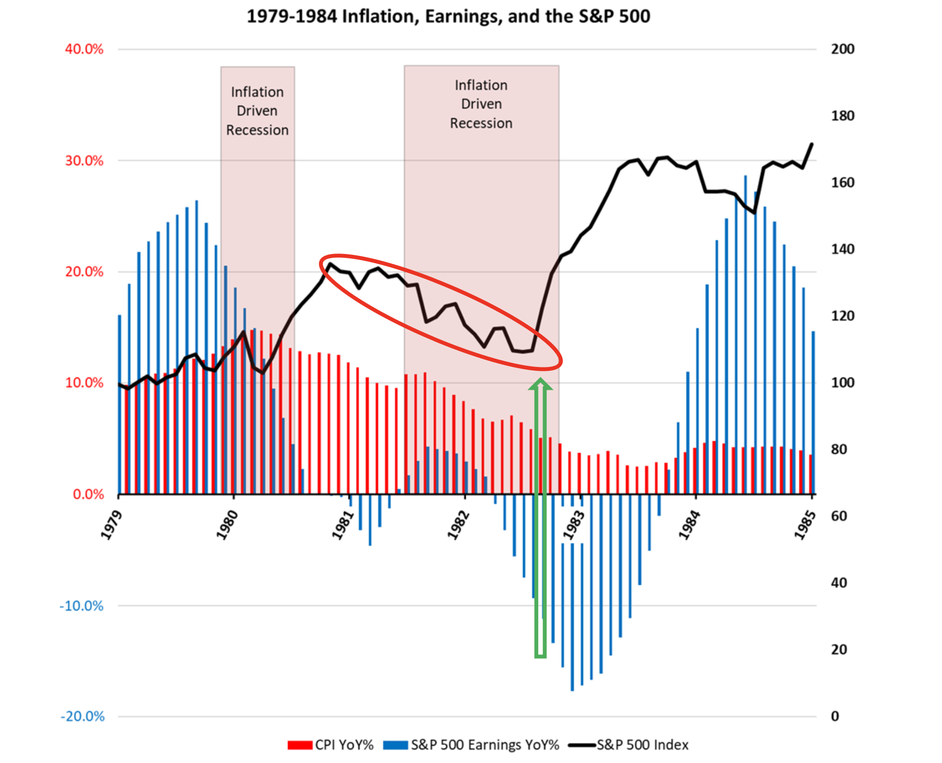 Figure 3 – 1979-1984 Inflation, Earnings, and the S&P 500
Source: Bloomberg Finance L.P. (03/27/2023)
The next chart below is identical, except we have replaced the price of the S&P 500 with its P/E ratio (solid orange line). This chart illustrates the valuation that was assigned to the market as we moved through the inflation fight of the early 1980s. As the market dropped, it moved from a high valuation in 1980 of ~10.01x P/E to a low valuation of ~6.64x P/E (we are using trailing 12-month P/E throughout this study for the purposes of consistency). However, as the market went down, we note again that valuations started moving up dramatically (green arrow) before earnings bottomed and before the recession ended. Forecasters expecting lower valuations because of lower earnings were left flat-footed as the market moved higher and began to recover.
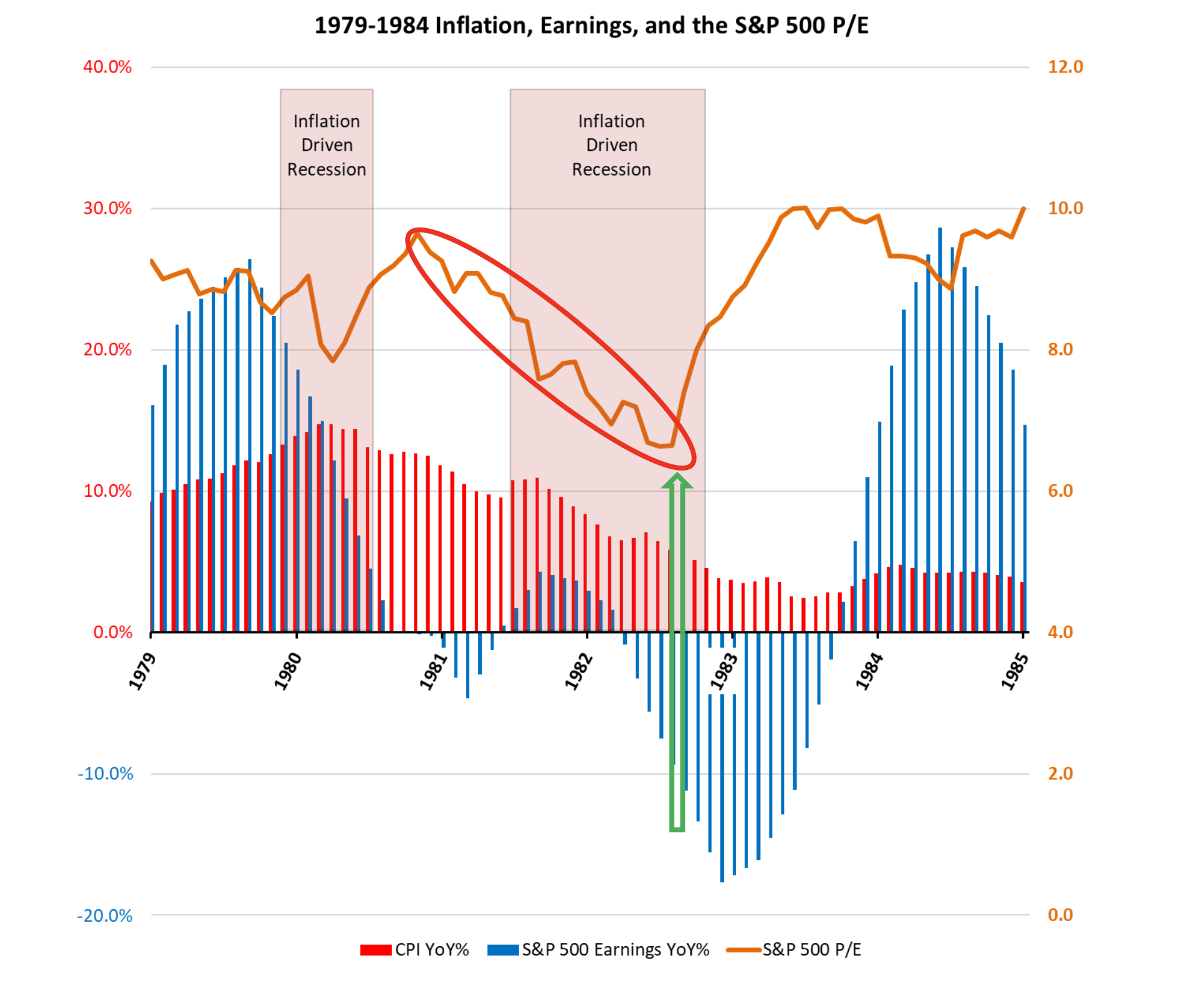 Figure 4 – 1979-1984 Inflation, Earnings, and the S&P 500 P/E
Source: Bloomberg Finance L.P. (03/27/2023)
Today’s Battle Against Inflation
During the current inflation battle, we have already seen the Fed raise rates more aggressively than at any point since the early 1980s, and the major indices have experienced peak-to-trough declines in closing prices of as much as -25.43% on the S&P 500 (closing prices, excluding dividends from 1/03/22 to 10/12/22) and -36.40% for the NASDAQ Composite (closing prices, excluding dividends from 11/19/21 to 12/28/22). Let’s take a look at these same metrics today to see if there might be any comparisons.
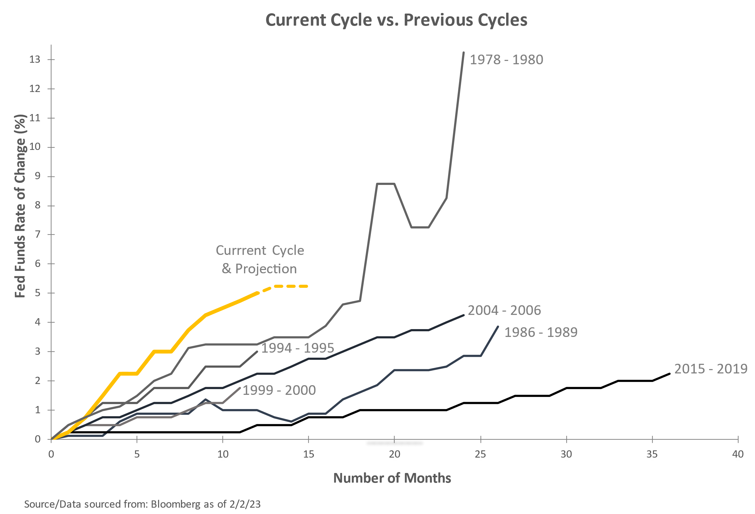 Figure 5 – Current Cycle vs. Previous Cycles
Source: Bloomberg Finance L.P. (02/02/2023)
The chart below shows the same data on inflation (CPI YoY%, red bars), S&P 500 earnings growth (YoY%, blue bars), and the S&P 500 price index (solid black line). The red circle highlights the recent decline in the index with the current low set in October 2022 at -25.43% from the S&P 500 high. The chart also illustrates inflation and earnings growth, both currently decelerating.
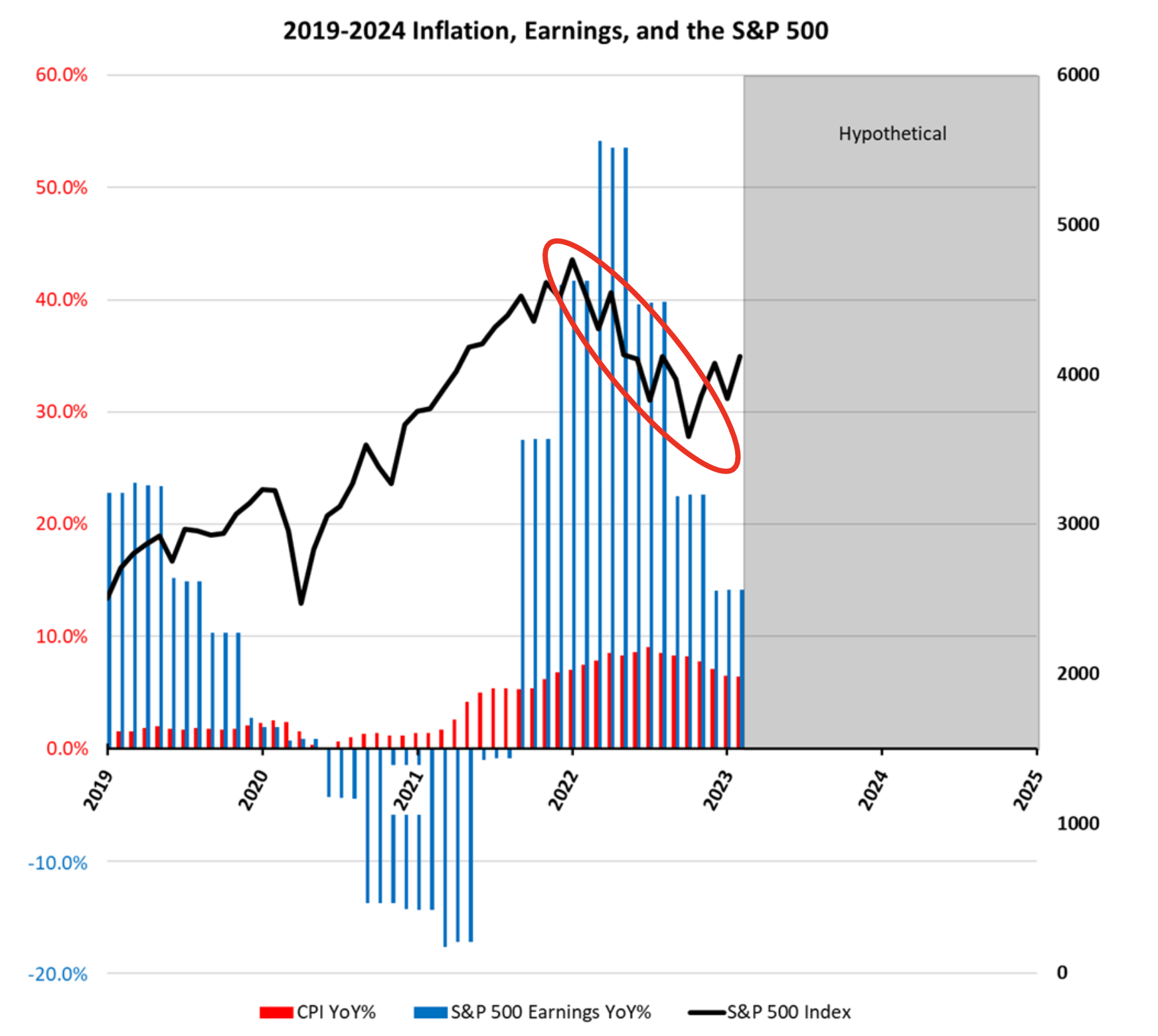 Figure 6 – 2019-2024 Inflation, Earnings, and the S&P 500
Source: Bloomberg Finance L.P. (03/27/2023)
The chart below demonstrates how the P/E ratio for the S&P 500 (solid orange line) has dropped dramatically since the pandemic stimulus-driven highs set in 2021. The S&P 500 has dropped from a high P/E multiple of 32.95x to its current level of 19.05x.
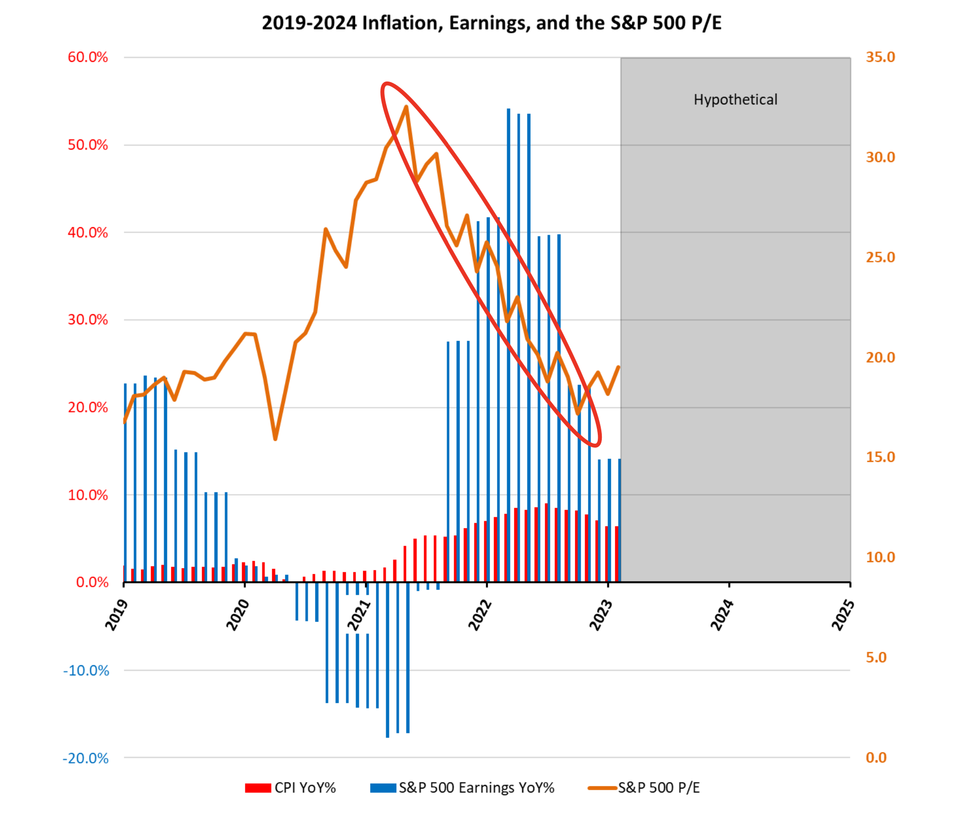 Figure 7 – 2019-2024 Inflation, Earnings, and the S&P 500 P/E
Source: Bloomberg Finance L.P. (03/27/2023)
It is clear that many valuation excesses have been removed from the market over the last two years, and there is now a race by the “experts” to guess what the low valuation multiple will be for this cycle. Before we start considering current valuations, though, we need to have a way to compare those valuations between different historical periods. The S&P 500 is currently at 19.05x P/E, while the levels in the early 1980s ranged between 6.64-10.01x P/E. To compare the two periods, we must consider the overall level of interest rates at different times. When interest rates are high, it generally puts pressure on equity markets, as investors will likely (marginally) favor a lower-risk, interest-bearing alternative relative to stocks. When rates are lower, stocks are generally preferred. This is referred to as the competition for capital between bonds and stocks.
The chart below illustrates the relationship between the quarterly P/E ratio (Y axis) for the S&P 500 from 1962 through today and the interest rate offered on the 10-year U.S. Treasury note (X axis). The green line represents a statistical “best fit” of the data plotted. In general, the P/E valuation for the S&P 500 tends to decline as the interest rate on the 10-year U.S. Treasury rises. In 1980, with rates near 12%, the P/E for the market clustered around 10x. Today, with the 10-year UST currently under 4%, the P/E for the market has historically clustered around approximately 15x to 22x (green oval). The level of interest rates greatly impacts the fair valuation of the markets. We don’t start seeing consistent valuations below 15x P/E until we reach almost a 7% 10-year UST, and we are nowhere close to that today. It should also be noted that the P/E for the S&P 500 on the day of the October 2022 low was 17.15x, very much in line with the data below.
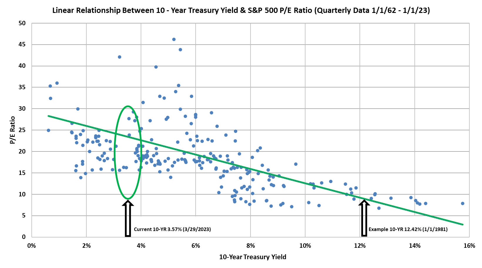 Figure 8 – Linear Relationship Between 10 Year Treasury Yield & S&P 500 P/E Ratio
 Source: Gurufocus.com (03/27/2023)
Since the Fed seems to be trying to engineer some level of recession to combat inflation, it is also important to distinguish between different types of recessions. In 2008, the financial system was essentially broken by the rampant leverage major financial institutions applied to instruments related to the ultra-hot and unsustainable housing bubble. The damage was so bad that it took every effort of the federal government and the Federal Reserve to save the economy and absorb all the bad assets. It was called the Global Financial Crisis for a reason, and we were all introduced to the concept of “quantitative easing.” We would characterize that as a “throw the baby out with the bathwater” recession. It was a violent period of extreme volatility for the market, and there was fear that the entire financial system might collapse. Right now, leverage in the system is comparatively moderate, and the Federal Reserve is actually (seemingly) trying to intentionally engineer some level of a recession in its efforts to slay the inflation demon. We are currently seeing stress in the system as the Fed typically raises rates until they break something (as in the Silicon Valley Bank failure). However, we do not see this period in the same light as the GFC. Recessions are never a welcome event, but we do not expect the same level of severity that we experienced in 2008/9 at this time.
While extreme forecasts might make for great headlines, we do not see these unfolding under current economic conditions. Earnings may indeed go lower. Interest rates may also go higher. Both of these variables directly impact valuations, but it is critical to learn the lessons of the past. In this case, history clearly illustrates that the market can bottom both in price and valuation well before the fundamentals support a change in direction. If the experience of the early 1980s plays out similarly, the markets can be expected to bottom well before the fundamentals reflect that change.
It is also important to remember that many prognosticators on T.V. will generally predict lower lows when the market is done going down. Look for the same to happen this time, and be prepared. Predictions of an S&P 500 low at 14x P/E or even 12x P/E make for great headlines, but our research into the relationship between the level of the 10-year U.S. Treasury and valuations suggest that it is not likely unless we see earnings drop precipitously or rates start screaming higher on the 10-year UST. No one is going to be able to perfectly predict “the bottom,” so we recommend having a plan in place to take advantage of lower overall prices should they occur while maintaining a well-balanced portfolio that is designed to meet your long-term goals. As the hypothetical chart below postulates, at some point in the future, it is reasonable to envision a world where:
- the Fed stops raising rates,
- inflation is under control,
- the recession—if it happens—is over,
- corporate earnings begin to rise again,
- and the S&P 500 resumes its long-term trend higher.
Since no one knows the exact date these things will happen, it makes sense to stick with your long-term plan and to glean some insights from the lessons of the past.
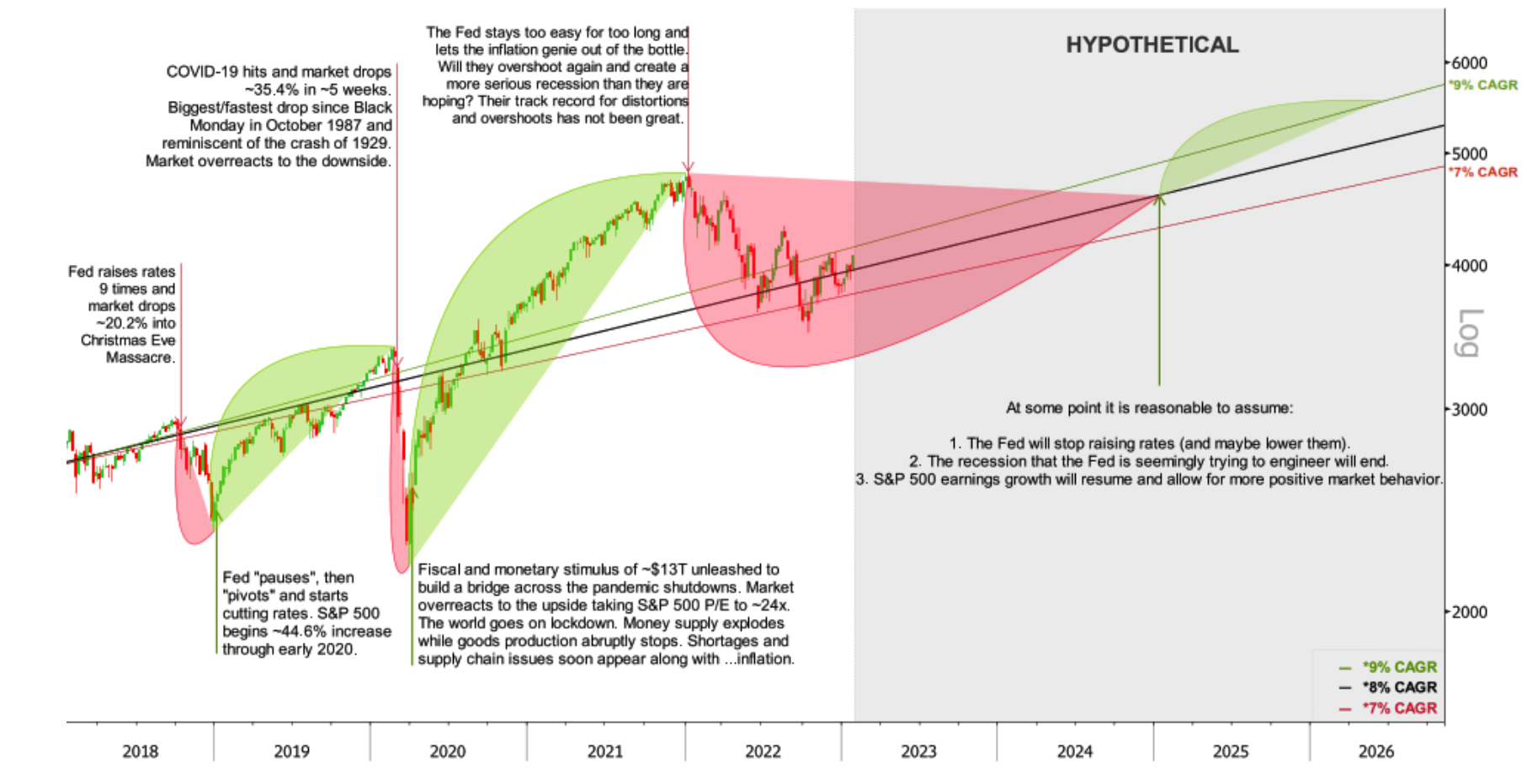 Figure 9 – How Fiscal & Monetary Policy Has Created Massive Volatility
Source: S&P 500 data sourced from Bloomberg 12/20/22 with annotations and hypothetical analysis by Alpha Cubed Investments
Disclosures
This document may contain forward-looking statements or images including our intent, belief, or current expectations with respect to market conditions. Readers are cautioned not to place undue reliance on these forward-looking statements or images. While due care has been used in the preparation of forecast information, actual results may vary in a materially positive or negative manner. Forecasts and hypothetical examples are subject to uncertainty and contingencies outside Alpha Cubed Investments’ control.
Alpha Cubed Investments, LLC (ACI) is a Registered Investment Adviser. This brochure is solely for informational purposes. Advisory services are only offered to clients or prospective clients where ACI and its representatives are properly licensed or exempt from licensure. Past performance is no guarantee of future returns. Investing involves risk and possible loss of principal capital. Please see our firm ADV for more information.
Any indices referenced for comparison are unmanaged and cannot be invested into directly (although there are investment vehicles that historically have closely approximated the composition and performance of many indices). Indices do not reflect the payment of advisory fees and other expenses associated with an investment in a mutual fund. Historical performance results for investment indices and/or benchmarks have been provided for general comparison purposes only. The Standard & Poor’s 500 Index is a market capitalization-weighted index of 500 large U.S. publicly traded companies by market value. The S&P 500 is one of the most common benchmarks for the for the broader U.S. equity markets. An index is a composite of securities that provides a benchmark for performance. Each index’s total return includes changes in price and reinvestment of any dividends or interest paid by the securities over the period indicated. A benchmark is a standard against which the performance of a security, mutual fund or investment manager can be measured. Generally, broad market and market-segment stock and bond indexes are used for this purpose.
Some of the research and ratings shown in this presentation come from third parties that are not affiliated with Alpha Cubed Investments. The information is believed to be accurate but is not guaranteed or warranted by Alpha Cubed Investments. Content, research, tools, and stock or option symbols are for educational and illustrative purposes only and do not imply a recommendation or solicitation to buy or sell a particular security or to engage in any particular investment strategy.
Historical performance results for investment indices and/or categories generally do not reflect the deduction of transaction and/or custodial charges or the deduction of an investment-management fee, the occurrence of which would have the effect of decreasing historical performance results. Economic factors, market conditions, and investment strategies will affect the performance of any portfolio, and there are no assurances that it will match or outperform any benchmark. Indices are unmanaged, do not incur fees and expenses, and cannot be invested in directly. Indices do not reflect the payment of advisory fees and other expenses associated with an exchange-traded fund.
[1] Carlson, Ben. “These Charts Show How Bad the Economy Was When Paul Volcker Took over as Fed Chair in 1979.” Fortune. Fortune, December 9, 2019. https://fortune.com/2019/12/09/charts-1973-19174-economy-paul-volcker-fed-chair/.